Spectral Analysis Of Certified COVID Death (part 6)
I put down my engineer’s spectral spanner and pick up vaccine records to discover the magical elixir has done nothing to alleviate incidence of symptomatic COVID amongst 3,412 in-hospital deaths
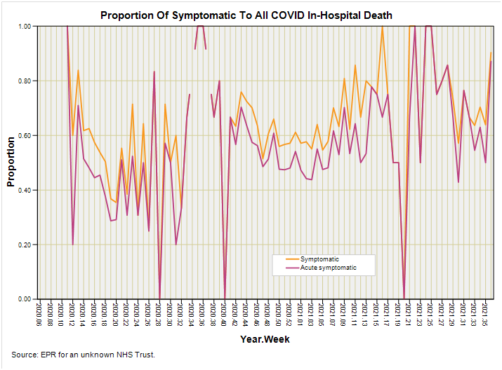
In part 5 of this series I finished with a slide that some of you may have missed ‘coz Substack doesn’t send out emails if I revise articles, which is why it is always best to check the latest online version before you quote anything. I sometimes drop a clanger and will revise figures, text, tables, slides and conclusions as quickly as possible, dropping a comment to alert subscribers, so it’s always a good idea to check the comments section also. If you’re not going to quote my work then you can relax, pour a cuppa, and forage in the biscuit tin in full knowledge that the rolling pin of truth is whirling behind the kitchen door to bring you the best bake of all possible bakes.
If you think that last sentence might be an obscure play on words you’d be right, for on BBC R3 right now they are playing the overture to Bernstein’s Candide, being an operetta based on the novella by Voltaire. Though published in 1759 it is as fresh and relevant today as it was back, with goodly folk of the land optimistically placing faith and their lives in the hands of the government and their vaccinating machine. Now for that final slide once again to save folk foraging:
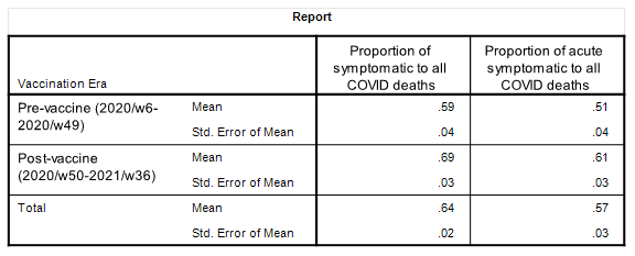
What we have here is a visual summary of the essence of boiling down 3,412 adult in-hospital deaths flagged with a COVID diagnosis over the 84-week period from 2020/w6 to 2021/w36 within a sizeable NHS Trust whose identity remains unknown to me. If we are to derive the grand mean for each series then we’d find symptomatic COVID death (COVID deaths with an ICD10 code in the range J00 – J99) fetching-up at a proportion of 0.64 (64%) and acute symptomatic COVID death (COVID deaths with ICD10 codes pointing to pneumonia, respiratory, failure, respiratory arrest and ARDS) fetching-up at a proportion of 0.57 (57%). If I now slice the data into pre- and post-vaccine periods we now get this little table that is brimming with interest:
Sticking my thumb out at this and squaring up I’d say we’re looking at an increase of 0.10 (10%) in the proportion for both symptomatic and acute symptomatic cases at a time when we’d be expecting the vaccines to be lowering the incidence of such. WERGH is once again the word, though a bit of formal significance testing using classical methods reveals these differences to be within the bounds of sample error.
In this regard there’s a rather splendid free online statistical calculator suite by MedCalc that I heartily recommend for such capers, with their comparison of proportions calculator yielding p=0.363 for symptomatic deaths and p=0.394 for acute symptomatic death. If I use my stats package to run another classic test used by medics – a Mann Whitney U-Test for independent samples – I arrive at p=0.068 for symptomatic and p=0.085 for acute symptomatic. Close but no cigar, but it would be interesting to see what the Bayesian bods can muster. My money is on no detectable difference owing to the noise of weekly samples bouncing from values of 0.00 to 1.00. However, I wouldn’t read too much into this because we have no idea what was happening in terms of disease prevalence and testing regime. Even if we compare counts on a week-by-week basis this still doesn’t tell us what bugs were out there and what clinicians were deciding to do to their patients. This analysis is not unlike a soufflé waiting for somebody to puncture it with a knife!
Crispy Bottom
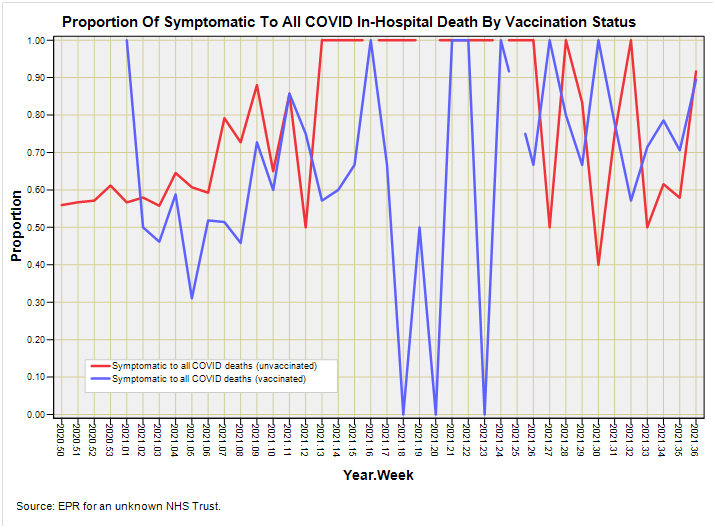
I can try and bake a crispy bottom by considering vaccination status. The assumption here is that both vaccinated and unvaccinated in-patients would have been exposed to the same bugs, patient management and COVID testing over a common time period thus flattening these biases to some extent (do I hear someone laughing?). Nevertheless, let us have a look at a slide where I’ve separated in-patients into vaccinated and unvaccinated cohorts, thence to derive the proportion of symptomatic to all COVID deaths within each cohort for the period 2020/w50 – 2021/w36:
This isn’t just fascinating but utterly fascinating! If we can set aside a list of caveats longer than my arms (and I was born with very long arms) then we find what appears to be an initial disbenefit for vaccination during 2021/w1 that flips into an apparent benefit from 2021/w2 to 2021/w10 that evaporates until we reach 2021/w13 when something rather odd happens. From 2021/w13 to 2021/w26 unvaccinated cases suddenly hit the roof at a proportion of 1.00 (100%) whilst vaccinated cases suddenly hit the floor at a proportion of 0.00 (0%) as well as smacking into the roof! Just what the heck was going on during this period?
My gut tells me we are not looking at the impact of mutant strains and we are not looking at the impact of the vaccines; what we appear to be looking at is some sort of clinical decision-making or policy change. It is as though somebody decided things weren’t going to well back in 2021/w12 and ensured the unvaccinated cases became symptomatic (or unvaccinated respiratory cases magically became COVID cases), whilst vaccinated COVID cases magically became asymptomatic (or asymptomatic COVID cases were hunted down in droves if vaccinated).
It’s quite clear to me that somebody was playing silly buggers for a while up until 2021/w26 when cases were allowed to be what they were once more. From 2021/w26 onward it is hard to tell whether proportions are lower for vaccinated or unvaccinated cohorts and this is rather telling. All things being equal we would expect to see the blue line bouncing around the bottom half of the graph and the red line bouncing around the top. This is not what we observe; we observe similarity in rate, from which we may infer the vaccines have done nothing to alleviate case severity.
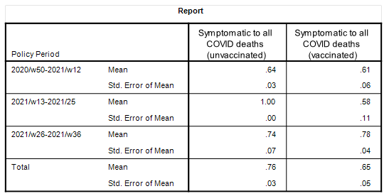
I guess I better put some numbers down in a table, and to do this I better carve the data into the three policy periods of: 2020/w50-2021/w12; 2021/w13-2021/w25; 2021/w26-2021/w36. Is it just me or are those cut-off points at week 13 and 26 tasting just a little bit administrative? H’mmmm…. well here’s the table:
Take out the big crazy of 2021/w13-2021/w25 and you are looking at two periods that are very similar in mean proportion. To check this in a rather more formal manner I decided to exclude the big crazy and pool the data. This is what this looks like:
We’re looking at pretty near identical mean values for unvaccinated and vaccinated cases over the non-crazy period, from which we may conclude that there is absolutely no evidence to support the notion of vaccine benefit in terms of reduction in incidence of symptomatic COVID cases. For the record a classic comparison of proportions using the MedCalc freebie yielded p=0.941.
So what about acute symptomatic cases? Surely the magical elixir must have thrown-up some sort of benefit for extreme cases such as these? Tune in next week to find out!
Kettle On!


I tend to click on the like button on the email so that the article opens separately and I can see any changes. I recommend this method to everyone! Yes, because it ratchets up the like count!! "WERGH"? I don't know this term. I will be quoting you again this week!
I don't think anything can be said based on the blue line not getting down after vaccines. If it could they wouldn't be doing test-negative studies. What makes more sense to me is this: Look at (symptomatic covid deaths)/(all-cause deaths) both pre and post vaccine. Kind of like a proportional reporting ratio.