What Was COVID-19, Exactly? (part 2)
In this miniseries I try to fathom what COVID was supposed to be using a sample of 21,810 adult in-hospital deaths over the period 2020/w1 – 2021/w36 for an undisclosed NHS Trust
Subscribers to John Dee’s Almanac will have seen me bashing my head month after month trying to tackle COVID-19 as a respiratory disease. It’s been a very slippery customer and at times I’ve even questioned whether a virus has existed! I’ve persevered largely because COVID-19 has been primarily sold to us as a respiratory pathogen and it is the image of the critically ill patient on a ventilator that has scared the shine out of the public. NHS posters of such have hammered this home to the point where I’m still seeing sorry souls wearing filthy masks in the open air in our beautiful parks and spaces. These folk have been psychologically damaged for life and I don’t see anyone being held criminally responsible any day soon; I guess the government is not about to go overthrow itself and bring charges.
If I were to summarise my 303 articles to date it would be to say that COVID-19 has not acted like a bone fide respiratory disease let alone a novel and deadly pathogen. This observation is based on careful analysis of official data, though I fully appreciate there have been troubling case studies from the coal face that point to something nasty. In this regard I’ve had battle weary registrars angrily shouting at me, and whilst this is entirely understandable what clinicians often fail to grasp is that their tortuous case load has not been representative of the national clinical picture. If it were we’d have been using the army to ferry the dead long ago.
So what gives? It’s hard to say for we appear to have experienced a mighty strange dissemination of a pathogen of sorts that appears to have been responsible for pretty much anything. I stopped counting declared symptoms when GPs started talking about hair loss, and I couldn’t help but notice how many symptoms overlap with those for radiation poisoning - I better not go down that rabbit hole today!
Over a fresh pot of rooibos I contemplated how I would go about building an indicator I am going to call integrated COVID (iCOVID) when the through struck me that I could set case detection rate (cases per 100 viral tests as derived from the UK GOV coronavirus dashboard for England) as the dependent variable in another of those infernal staged multivariate models of some description. Whatever we may think of the PCR test it was primarily this viral test (that is not actually a test) that defined the national sweep of curious and somewhat ill-defined conditions collectively known as ‘COVID-19’. The interesting angle here is that such modelling will reveal to us what that test actually meant in terms of ICD10 diagnostic coding of in-hospital deaths.
We can juice the study up further by splitting the data into three periods that cover the mysterious spring 2020 peak, the not-so-mysterious 2020/21 seasonal peak, and the more recent post-vaccine era, the idea being that we should arrive at three similar but parallel models if COVID was doing its same thing over time. If we don’t arrive at similar models we need to start asking some thorny questions as to how an alleged highly specific and novel virus can change its spots.
Once we have models describing the spread of something across the nation we can then take a look to see how these square with diagnoses made during the historical period of January 2017 – February 2020 for the NHS Trust in question. I’m not expecting this lump of analysis to be easy, slick or quick so I suggest some important preparatory work like plates of sandwiches covered in cling film and investment in a tea urn.
Now to begin at the beginning…
The Beginning
Case detection rate (CDR) is derived from the UK GOV coronavirus dashboard, being the rolling 7-day count of new COVID cases detected in England divided by the rolling 7-day count of viral tests undertaken, this figure being a reasonable proxy for disease prevalence across the nation and thus a crude proxy for individual risk of infection. The value of CDR estimated for the nation of England as a whole was assigned to individual inpatient records with reference to the date of death and incorporating a delay of 14 days. Thus an in-patient dying on, say, 14 September would have been assigned a case detection rate derived for the nation of England for 1 September. Refinement of lagged effects beyond this crude approach was not possible owing to lack of admission date and lack of final PCR test date.
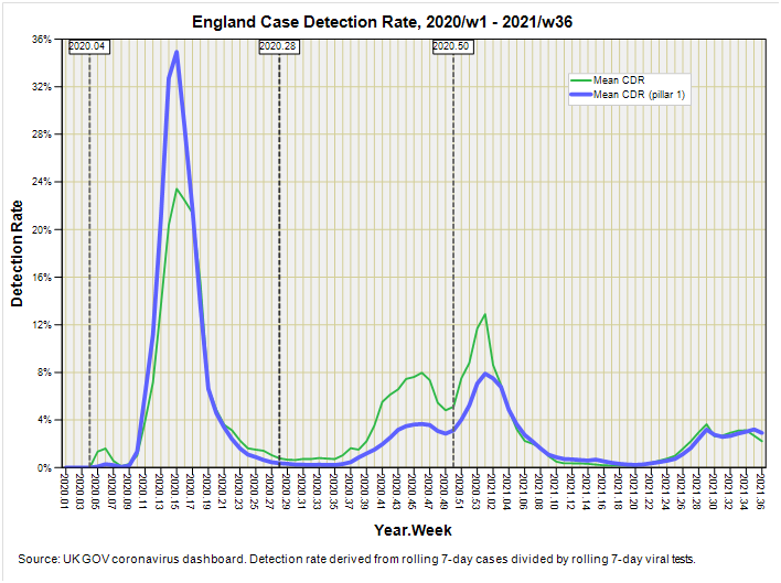
A refinement that was eminently possible was to derive the case detection rate for pillar 1 testing (those with a clinical need), this arguably being more appropriate for an in-patient cohort. Again rolling 7-day figures were derived to smooth administrative wrinkles, this time using new cases pillar 1 by specimen date for the numerator and new pillar 1 tests by publish date for the denominator. The two detection rates are compared in this slide that also reveals the thresholds adopted for the three pandemic phases:
In the beginning COVID-19 was essentially a nosocomial phenomenon, spreading through our hospitals with uncanny speed to the point of synchronous intake: a bizarre feature for a virus that is supposed to spread within the population rather than nobble the institutionalised all at once! As we may observe the tables are turned for the second phase, with the population at large returning the greatest proportion of positive test results. How many of these were false positives I shudder to think. Lives and businesses were ruined simply because of an inane decision to test healthy individuals by the million and then cajole the willing into testing themselves regardless of whether they felt unwell or not. A greater recipe for numerical mayhem I cannot imagine, and if there ever was a genuine pandemic of some degree it would have been buried in this ocean of tripe.
But I digress!
If I chop the data into these three phases I am left with 6,274 in-hospital deaths for phase 1 (2020/w4 – 2020/w27), 5,249 in-hospital deaths for phase 2 (2020/w28 – 2021/w49), and 9,740 in-hospital deaths for phase 3 (2020/w50 – 2021/w36). I also have 36,294 in-hospital deaths from the pre-pandemic period 2017/w1 – 2020/w3 waiting in the wings.
A Curiosity
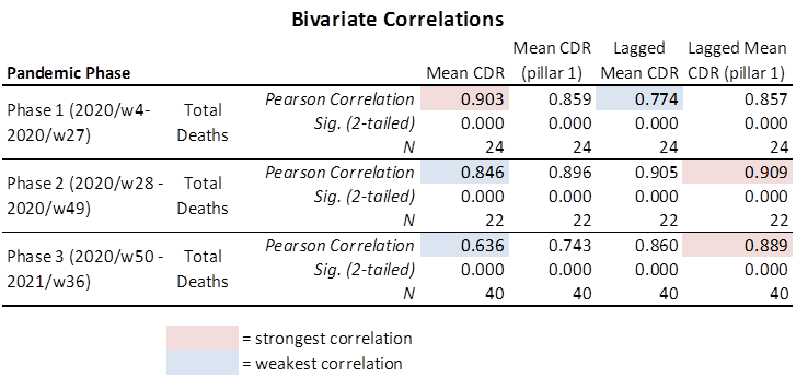
Whilst sipping a jolly lovely mug of Waitrose No.1 Colombian Reserve graced with La Perruche pure cane rough cut sugar cubes I thought I’d better double-check my assumption of a 14-day delay between pillar 1 case detection rate and date of death, so I ran out a basic Pearson correlation matrix just to satisfy my inner monkey. I’m glad I did because I came across a most curious result:
It transpires that phase 2 (2020/w28 – 2021/w49) and phase 3 (2020/w50 – 2021/w36) fall in line with my assumption that in-hospital deaths will be more closely associated with the pillar 1 testing regime following a 14-day lag, these returning the strongest correlations of r = 0.909 (p<0.001) and r = 0.889 (p<0.001) respectively.
So far so good, but now take a peek at the coefficients for phase 1 (2020/w4 – 2020/w27). The strongest correlation for in-hospital death is with the overall case detection rate without any lag (r = 0.903, p<0.001). This is most peculiar for it is basically saying that, during phase 1, folk (largely in-patients) died a pretty instantaneous death from a virus that is now known to be as lethal as the flu, yet a few weeks later the same virus was following a typical clinical course. If this curious result doesn’t raise suspicion I don’t know what will for it is pointing at iatrogenic death unless we can identify some other reason why death was peculiarly immediate during phase 1: a particularly vulnerable population, perhaps?
Assessing Vulnerability
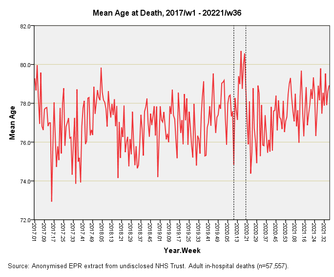
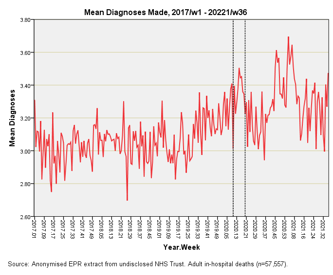
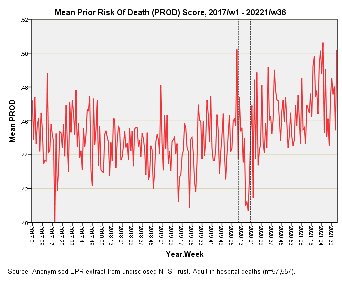
There’s umpteen ways we could go about this and I have opted to start out with three simple time series plots of mean age at death by week, mean number of diagnoses made per patient record by week, and mean prior risk of death (PROD) score by week. Here they all are for all adult (>=18 years) in-hospital deaths for the period 2017/w1 – 2021/w36:
This is pretty much what I was expecting. The dashed lines represent what I once called the catastrophic health collapse, being the extraordinary spring death spike of 2020 that runs – in this instance - from 2020/w10 through to 2020/w19. There is no mistaking that big bump in the mean age at death which means the elderly and most vulnerable particularly suffered, as has been thoroughly documented from the outset. This means we need to be cautious when it comes to assessing the likelihood of iatrogenic death (unless, of course, that firm evidence can be mustered for inappropriate use of end-of-life care pathways).
Now this is interesting for we observe a bump in the mean number of diagnoses made per patient record during the catastrophic health collapse but it isn’t the biggest bump on the block by any means. Bizarrely, the surge in case complexity comes early during vaccine rollout – and with two helpings at that. This is the sort of evidence to consider when assessing the additional burden of vaccine harm amongst an already sick population. Here that evidence is, and with two fingers sticking up into our faces!
I doubt that entirety of this deterioration in the health of the in-patient cohort can be solely attributed to vaccines and vaccines alone for there are many exogenous factors at large. Back when Boris announced the first lockdown (and effective closure of the NHS) it was pretty obvious that a terrible price was going to be paid at some point down the line, so I am thinking in terms of a mixed bag of effects in which vaccines are playing a major role. Indeed so, for it is sobering to realise that even the extraordinary catastrophic health collapse period cannot match the diagnostic mayhem post-rollout.
Now here’s one of those slides that throws up a curve call – and a wobbly one at that! The prior risk of death score (PROD) was devised to provide a proxy of how majorly sick in-patients were before they died. Big killers such as cancer and cardiac conditions push that score up, as does major CNS conditions, sepsis and key organ failure (liver, kidney). We’re talking very sick people needing serious care.
Incredible as it may seem this score took a dive during the catastrophic health collapse period which means these heavyweight cases must have been shunted elsewhere. I presume this resulted from a policy of clearing beds in order to make way for an influx of younger COVID cases. Not only did those younger cases not turn up, but those shunted would have faced certain death in lower dependency care units. I’m not sure how healthcare professionals are living with this grim and rather dark episode.
A Mixed Bag
We are left with a mixed bag of results that suggest we cannot pin catastrophic health collapse on vulnerability alone and walk away to wash our hands of the matter. It’s quite clear that heavyweight cases were shunted to create beds and that it was the elderly with a string of comorbidities that bumped the numbers, as has been made clear all along. Perhaps more disturbing than this is the rise in mean diagnoses made and elevated PROD scores in the post-vaccine era: this is a problem that isn’t going to go away any day soon.
Kettle On!


We've lived through the most bizarre time in history, where it's felt like the NHS has been at 'war' with us. The grifting, gaslighting, censoring and roll out of the mRNA biological product has been a tightly coordinated operation. The truth will eventually find a way to the surface and I really hope that brings us an opportunity to start again with a new, shiny NHS, that puts patients before profit.
Thank you for helping us to make sense of it all. As I see empty houses, where friends used to live and others with post vacciene immune system catastrophes, I'm very grateful to be unjabbed.
1. The first big rise in mean diagnoses precedes vaccine rollout, does it not?
2. Random idea: Say you take any variable. Then you associate that variable with just one specific time bucket, according to which time bucket had the largest "happening" with that variable. A "happening" may be something like "the largest change in the 7-day moving average of that variable, relative to the prior time bucket". Brute force this for every available variable. This is like every variable is a ball that gets thrown into one bucket, and at the end you count and see if any time bucket has an unusual number of balls. Or maybe better, rank the size of the happenings for each time bucket. Then sum up all the ranks within each bucket. Maybe this will pop "interesting" time periods such as vaccine rollout.