Counting Deaths (Part 1)
A comparison of official counts all cause deaths by date of registration (England) with counts by date of occurrence
When it comes to counting death the Office for National Statistics (ONS) prefer to use the date of registration rather than the actual date of death – you can find many examples here. Delays are par for the course and the ONS explain these in this handy document, along with the various stages undertaken before a death appears in the national statistics. The greatest delays in processing occur during holiday periods, especially over the festive season, and these can produce artefact that can throw analyses, a fine example being my series on Vaccines & Death that is currently unfinished at part 9 owing to methodological headaches.
We may ask why the ONS don’t adopt date of death as the standard for all outputs instead of date of registration, the actual date of death being the rather obvious criterion. This question was put to them and here is the reply from one of their officers:
Legally a person has 5 days to register a death with the General Register Office. These registrations come through to ONS on a daily basis where they are loaded on to our system for validation and coding. Some deaths are registered weeks or even months after the date of death; see our report on registration delays here which gives more detail on why these delays occur.
This merely served to confirm the problem so they were asked again, to which their answer was:
We present data based on registration date and date of occurrence.
So I checked their extensive collection of published datasets and did indeed find datasets by date of occurrence but noted all of these originated from FOI requests. Anyone who has gone through the FOI process with the ONS will realise that they charge, details for which may be found here. So, yes, they do present data by date of occurrence but only if you ask for it and are prepared to shell out. The officer continued with this useful information:
An occurrence and registration week for deaths begins each Saturday and runs to the following Friday. Around 46% of deaths are registered in the same week of occurrence. This rises to 85% on average by the end of the following week. Thus, if there are 10,000 deaths in a given week, we expect that 4,600 (46%) are registered that week and another 3,900 (total 85%) by the following week.
Whilst this was encouraging to hear 85% still leaves a lot of deaths out of the picture at the end of the second week, and we should note this is an average that may hide some pretty wild variations. I wondered how the registration and processing system coped during the pandemic, and particularly so after vaccination rollout – were deaths being processed as normal or did a backlog build?
I got to thinking I could check the matter by downloading one of the FOI datasets with counts by date of occurrence and comparing these against published counts by date of registration. Herewith a summary of my findings.
The Pre-pandemic Era
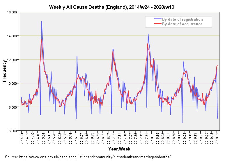
Defined as 2014/w24 – 2020/w10, I present a time series plot of counts for all cause death for England as extracted from the weekly series of ONS publications (by date of registration) together with a time series for counts for all cause death for England by date of occurrence as derived from the FOI file: Daily deaths by date of occurrence, 1 June 2014 to 31 July 2022 by single year of age and sex, England:
The first feature to not here is the impact of the festive season on the registration counts, which are suppressed by around 2,000 – 3,000 cases during week 52 of each year when compared with counts by date of death (big blue spikes downward). Other holiday impacts are readily discernible for week 22 and week 35 of each year. There are times when the tally for weekly registrations exceeds that for weekly occurrences and these short blue spikes upward are indicative of backlogs being cleared, with weeks 2, 17 and 23 being popular.
Our eyes tell us these two series exhibit noteworthy differences and we can formally check this for the full year period 2015/w1 – 2019/w52 by running a related-samples Wilcoxon signed rank test to analyse the positive and negative differences between the two series, the null hypothesis being a zero value for the median of differences. This test revealed 152 negative differences and 109 positive differences, with a p-value fetching up at p=0.007.
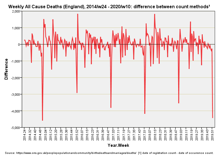
We can visualise the situation a different way by plotting out the difference in weekly counts, which gives rise to this series:
Those downward pointing large red spikes are the week 52 processing discrepancies writ large, and from this slide we can see these can approach 5,000 deaths in some years. Backlog clearance can be seen to give rise to a surplus of 2,000 weekly deaths in certain years. These swings sure can make a mess of analyses! Summary stats-wise the differenced series offered a minimum of -4,590 deaths, maximum of +1,834 deaths, median of 71.50 deaths and mean of -6.58 deaths, the distribution being positively skewed; that is, there is a preponderance of small positive values from which a few long negative tails hang.
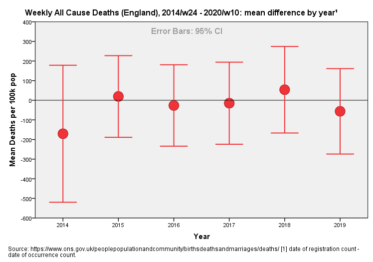
We may wonder if these weekly differences have remained similar over 2014 – 2019 and to this end I’ve generated an error bar plot:
I’ve included 2014 for the sake of completeness but please note that the overall mean value for the difference is depressed because we’re missing weeks 1 – 23. If we pay attention to the complete years 2015 – 2019 then we see no trend (p=0.958, ANOVA). We may conclude that it was business as usual in the pre-pandemic era!
Up Next…
In part 2 we’ll take a look at the post-pandemic era and I’ll further investigate use of T4253H smoothing to overcome processing artefact in the weekly count by date of registration (see part 7 of my Vaccines & Death series for an introduction to this technique). Until then…
Kettle On!


To be honest weknow they can be delays in processing, what shouldn’t happen is the juggling act that seems to be relentless where governments and departments are concerned. Once a death is logged is should be on the correct day and week stats for all to view.
Governments love the old sleight of hand trick where numbers are concerned, they’ll flip from actual numbers to percentages when they are projecting whether they’ve hit or missed a target or just want to instill fear.
I don’t really watch msm but when I do I read rather than just listen to what they are saying, I wish the public did more of this as you learn far more observant than just being spoon fed what they want you to know. I’ve been a people watcher since I was a kid and it makes it a lot easier to spot body language and behaviour from what someone is saying.
Another suggestion: Could waning VE also be related to increased testing the longer it has been since a person’s last dose (i.e. clinicians start having less belief in a person’s protection over time)? Not sure how to test that. Maybe a correlation between doses given and tests given that increases with increasing lag, maybe isolating just some more distinct vaccination waves.”