Primary Clinical Outcomes For A Single Emergency Department 2017 - 2021 (part 4)
SMLR modelling of 1.9 million admissions records for the emergency departments of an undisclosed NHS Trust: predicting risk of treatment & hospitalisation in the vaccine era
To understand what I’m doing with all this staged multivariate logistic regression modelling (SMLR) of admissions to the ED of a single UK NHS Trust readers will need to go back and absorb part 1, part 2 and part 3. What it all boils down to is attempting to provide a level playing field for when we compare patient cohorts across periods of time. Differences in age, sex and diagnoses made are as certain as green energy taxes, and we have to face the tricky issue of clinical protocols changing over time that may alter the rate at which admissions are treated and/or hospitalised. Call that rate something fancy like ‘propensity’, ‘risk’, ‘likelihood’ or ‘probability’ and you arrive in the land of the applied statistician.
We can observe real world rates for treatment/admission and quote them as percentages, proportions, ratios or odds ratios, and we can use statistical modelling in an attempt to predict these real world rates from a bunch of factors. Those predictions, when churned out of a logistic regression that attempts to model binary (Yes/No) data, fetch up as continuous variables we might call ‘risk scores’, ‘probabilities’ or ‘propensity scores’. If these scores are derived using a control sample or control period then we end up with unbiased estimates of the likelihood of somebody being treated or hospitalised, ‘unbiased’ meaning that the scores will be untainted by any changes in procedure or protocol that may have taken place in the study period.
We all know that the NHS underwent the biggest and most traumatic change in its history during the draconian pandemic year of 2020 as wards and services were closed down and dubious COVID protocols implemented, and all with very little connection to evidence-based medicine. We must therefore expect strange contortions within treatment and admission rates during this period and, TBH, the following year of 2021 also, when the NHS was still recovering from the shock of totalitarian government. This is why it is valuable to have a set of predicted scores to hand that suggest what should be happening with treatment/hospitalisation rates under ‘normal’ circumstances. That’s the logic anyways, and my models seem to be saying sensible things that match experience.
What I’m going to do today is use the method to look at the vaccine era of 2020/w50 – 2021/w37 to see if any distortions are apparent. By ‘distortion’ I mean observed treatment and hospitalisation rates drifting away from predicted normality given the changing characteristics of the patient cohorts. If this makes sense I suggest we make a cuppa and treat ourselves to a slice of fresh-baked Madeira cake before proceeding to the tables.
Comparison of Periods: Crude Crosstabulation
We have two tables on the menu, starting with a cross-tabulation of period against treatment and ending with a cross-tabulation of period against hospitalisation. These are our observations of what actually went on without adjustment for risk factors:
Treatment
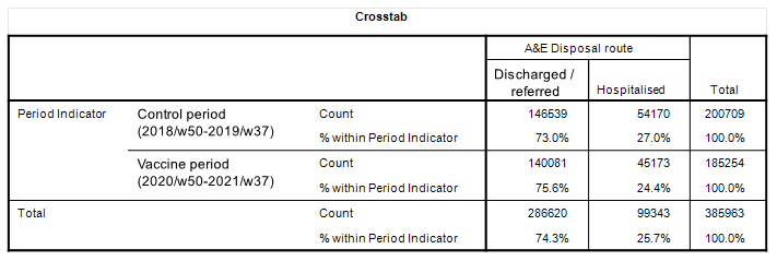
On the face of it we discover that treatment rates in the vaccine period were slightly lower at 63.2% compared to 68.3%. That’s a drop of 4.8% and is a result I’m inclined to pay attention to, though we have yet to account for potential differences across cohorts.
Hospitalisation
Here’s another result I’m inclined to pay attention to, with a 2.6% decline in hospitalisation rates though those cohort differences could… er… make all the difference! Let’s look at these right now.
Comparison of Periods: Mean Risk Score
Treatment
Here we have the summary stats for the risk of treatment score and it’s pretty plain to see that both periods were more or less identical in terms of the case mix coming through the front door. This being so we might start to take that 4.8% drop in risk more seriously. But here’s the thing… assuming equivalent case profiles between control and study periods then what might well be driving a lowered rate for treatment in the vaccinated period is something to do with the decision-making process; a funky protocol for the vaccinated, perhaps?
Hospitalisation
Not quite as identical in terms of the mean risk score but certainly so in terms of the median. This suggests a distortion and we can see this via the maximum cores attained for each period, with a few more high risk cases back in the control period.
Settling The Scores
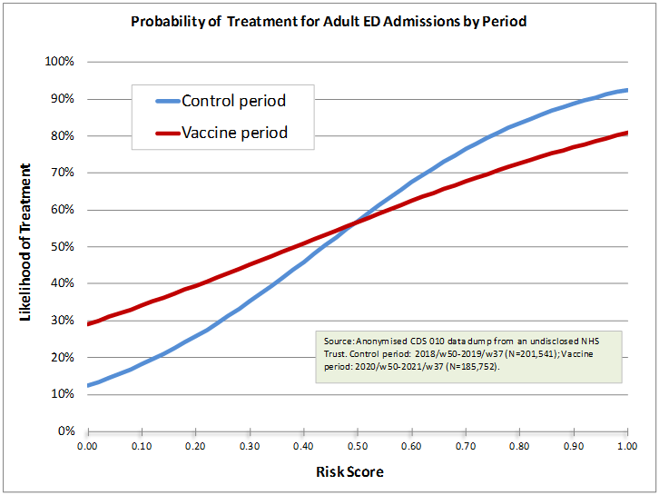
So far our eyeballs have led us along the path toward conclusion using percentages, rates, means and median but we ought to finish up with some logistic regression modelling of individual admissions to settle the scores and a couple of colourful slides to aid digestion. Here’s what happened to treatment as a primary clinical outcome in the vaccine period:
This is well funky and merits deep cogitation with something rather crunchy. If we take the control period of 2028/w50 – 2019/w37 as the reference for normality then we see something rather bizarre happening during the vaccine period in comparison. All of a sudden we’ve got an elevated rate of treatment after accounting for differences in the case mix for those who possess a low risk score according to ‘normality’. Why did ED physicians feel they had to treat people over and above what was taken to be the norm? Are we looking at evidence of vaccine harm?
What’s even more puzzling is the apparent reluctance to treat high risk admissions within the ED during the vaccine period compared to the control period. Was senior management telling medics what to do and what not to do? Were these cases wheeled through and out somewhere else? Whatever the cause it should be pretty obvious that something non-normal had been put into place during the first few months of 2021.
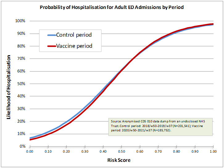
So let’s look at risk of hospitalisation…
Now this is what I would expect if nothing funny was going on. We have near identical hospitalisation rates over the entire span of predicted risk. Strange, then, that treatment rates should have gotten so twisted. We can also conclude from this that folk who were treated in the ED during the vaccination era were sent home. It is a shame we cannot follow this through for my data dump fizzles out in September 2021 with no chance (I presume) of obtaining a fresh slice taking us right through all the booster campaigns to the revelations of 2024.
Are Vaccinated Folk Different?
This is a billion dollar question and a half. I’ve seen studies reporting the ‘healthy vaccinee’ effect and I’ve seen studies showing the opposite, so who do we believe and what should we believe?
I’ve tackled this subject before in this article when I analysed something I called PROD (prior risk of death) and discovered that unvaccinated folk were sicker prior to death than vaccinated folk. I guess I better look at this again but in terms of risk of treatment and risk of hospitalisation, this being something else rather exciting that we can do with these scores.
But alas! I have run out of email, so the billion dollar question must sit in the fridge until next time
Kettle On!


A histogram of risk scores may be helpful.